Thursday, October 4, 2012

Origins of Violence | Entertaining Dissonance


Beginning work on a short series of four pieces, concerning violent behavior and where it stems from. Each piece will be focus on a different argument. Of course, there are plenty of grey areas, so there will be some overlap here and there. "Entertaining Dissonance" represents the controversy of violence growing from the media all around us. People have pointed the finger of blame to TV, movies, music, video games you name it. One down, three more to go. I'll post them as soon as they're done- one by one. 

Along with the illustration- I've been playing around a bit with GIFs so here it is animated!

Animated GIF

Linework

Wednesday, July 11, 2012

Homo Ferus | The Earth Mother


4th Image for the Homo Ferus Series- many more in the future. As always, I'm trying to push the atmosphere in my work. Keep that cell shading while adding some painterly aspects in there as well. I'm a man without a country- in love with graphic and bold- but at the same time, in love with foggy and blurry. Something that just flat colors can't quite capture. Short post today. Working on a few projects at the moment- some of them will hopefully make their appearance here soon.

Thursday, June 21, 2012

FrogFolio | The Storyteller

Illustration done for the FrogFolio calendar produced by Della Graphics. Every year, the calendar features some of the best illustrators working today. You can imagine how honored and shocked I was when the Art Director, Jim Burke, asked me to be a part of it. The only rule is that it involves frogs in some way.

After playing around with fables and fairy tales like the Frog Prince, I came across these wooden Frog masks from Bali. I've always had this weird obsession for older cultures around with world that have such different aesthetics from ours. I fell in love with the mask the second I laid eyes on it. From that mask, the idea began to grow into the person wearing it and eventually became just one piece in this traveler's wardrobe- picking up trinkets from each place they visit, carrying on stories from one destination to the next. 

There's items from China, Japan, Morocco, Africa, with others from as far as England and Ireland. 
Also, the characters on his robe are Anglo-Frisian runes for "Once Upon A Time. Or at least I think it is. It could be something like "Oncy Ipnh E Bime" or "My Feet Smell Bad"

Also, big news- I've started working on a comic book with a good friend of mine. 
Still in the writing stages but I'll be posting more later on. More coming soon. 
Linework
Thumbnails and Sketches

Thursday, June 14, 2012

SI Happy Hour


With recent events coming up, Kate Feirtag, the Society of Illustrators Exhibition Director, wanted to incorporate more illustration into the event fliers. Makes sense, right? I got dibs on taking care of the poster for Happy Hour. First idea was to run with kind of an Art Deco approach- in particular, the Empire State Building in all of its glory. We later decided, however, that it was a bit too quiet for what we were looking for. Back to the drawing board. Going with something a little more literal, I came up with some new sketches and got the go ahead on the first. It's just like me to go with a flower as ridiculously detailed as chrysanthemums.  Whatever doesn't kill you makes you stronger, I guess.
Original Idea for Happy Hour Poster
Second run of sketches
New Poster Without Text
Linework
Happy Hour is happening at the Society of Illustrators on June 20th from 4-8. Every one should stop by to say hello! Along with my flier, Tara Jacoby illustrated the poster for the Society's Cabaret Night, which you can and should check out here

In other news, I've been trying to figure out what the difference between my blog and tumblr will be. I'm going to try my best to keep them different (with the exception of big finals, which I'll post on both) so be sure to follow each one. I figure I'll tend to write more about the work and my thought process here, while post more smaller things like my instagram sketches on tumblr. We'll see, it's still up in the air. More coming soon.

Thursday, May 17, 2012

Tumblr

For those stopping by, I just started a tumblr for my work as well. Why don't you head on over and follow me. It would make my day, that's for sure. http://johnnydombrowski.tumblr.com/

Monday, May 14, 2012

Snake Eyes

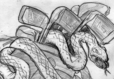
Here's an illustration I recently finished for Golf Digest. It was for their "Hungover Caddie" section about how to tell if your caddie has some money riding on you. Something that's really frowned upon and mostly kept quiet. We went with the sketch below, but my Art Director, Riva Schwartz wanted to add a bit more of a gambling feel to it. We thought it would be a cool idea to throw the ace in there along with a pair of dice. Good ol' snake eyes, of course. 
Thanks to Riva for the fun job! I'm very happy with how it came out. I'll be posting more soon.

Sunday, May 6, 2012

Insta

Every once in a while, I'll have late night sketch fits with drying out brush pens- like I did tonight. Though I don't tend to post them on here, I thought I'd throw up a batch for everyone to check out. I do, however, always post them on my twitter through instagram. If you don't follow me on one or the other... you should!

Both my Twitter and Instagram handles are jdombrowski


Photobucket Photobucket Photobucket Photobucket

Sunday, March 18, 2012

The Sounds of Rapture

Photobucket
An Illustration I did a while ago for KillScreen Magazine- and never got around to posting it. For an article about the sound design of the Bioshock franchise.

Big thanks to AD Keenan Cummings for the job!

Monday, March 5, 2012

Herald

Photobucket

I've been rather busy lately- all with work I can't show you at the moment, so I apologize for not posting as much as I'd like. At any rate, here's a new illustration I recently finished. I wanted to draw a knight... so I did. Simple as that.

As you can probably tell, I've been trying to experiment to see how far I can push my linework/coloring. While I do love the look of a crisp outline, I'm trying more and more to evoke a certain atmosphere in my illustrations. I think that's always been a focus for me. Creating a strange hybrid between line and something more painterly.

Photobucket
Linework

Not sure just yet what I'm going to work on next. I've had a comic book craving lately. but we'll see. More later.

Monday, November 21, 2011

No Man's Land

Photobucket
Image with Pulp magazine Adventure logo

Earlier this year, for about two months, the Society of Illustrators had an exhibit of Robert Lesser's Pulp Art collection. To this day, it's the one show that really stood out to me while working there. I was amazed by these oil paintings- quickly slapped down by artists like HJ Ward, Norman Saunders, Rafael De Soto, etc. And despite some reviews here and there I've read about the work, I think the craftmanship is remarkable. Sure, they are a bit rushed, but they had to be in order to survive in that line of work. Ever since that show I've been wanting do something along those lines.

Doing a Damsel in Distress/ Femme Fatale on the cover only seemed right. At the same time, to go in with my heavy blacks and leave them with the job of defining shadows in this creepy jungle. Despite the lure of a sexy figure, that trail can't lead to anything good.

Photobucket
Final image without text

Photobucket
Initial thumbs and reference from my sketchbook
Pencil sketches under a layer of inked tracing paper

Photobucket
Linework

Also, don't ask me why, but after inking this, I realized those two bird have appeared in drawings of mine before. I can't help it. I like those two birds.

Speaking of birds, Happy Thanksgiving! Hope everyone has a nice week. I'll be in touch.

Tuesday, November 15, 2011

The New Gold Rush

Photobucket
Here's a new illustration I did for a recent issue of Penthouse. It was for an interesting article about 20-30 year olds going back up in to the mountains above LA to pan for gold just like the 49ers use to. With the economic crisis we've been in, people are willing to try anything to get some extra money. I, personally, think it's an awesome idea.

Big thanks to Art Director John Faraci

Photobucket
Sketch

Photobucket
Layout

Wednesday, November 2, 2011

Backpacker | Gone Astray

Here's another illustration I did for Backpacker's Survival Quiz. This issue's theme was the risk of becoming lost in the wild.
Photobucket

Photobucket
Layout

Big thanks again to Jackie McCaffrey for the awesome Art Direction!

Monday, September 26, 2011

Sketchbook

Finishing up a few personal things that I'll post soon. In the mean time you can take a look at a few of my sketchbook pages and how obsessive I am with filling the page. Be it with drawings or pointless rambling.

PhotobucketPhotobucketPhotobucketPhotobucketPhotobucket

Sunday, September 4, 2011

Homo Ferus | Cracked Sky

Photobucket

Hope all is well with everyone. Especially after the hurricane for those on the east coast. Fortunately, I've been busy with a good amount of freelance work lately. Unfortunately, I can't show any of it to you. Yet. All in good time.

In the mean time, here is the new Homo Ferus. And one of many more to come, I might add. Every time I finish one, I think of three more to draw. Trying to concentrate on the essentials of survival, hunger and food for the first two, I now wanted to approach shelter and exposure to the elements.

I've been considering posting some detail shots everyonce and a while. Maybe I'll do it for this one. We'll see.

Photobucket
Linework

It's got to that point where I've begun to describe the series to other people and even with only three pieces finished, this boy is certainly growing as a character for me. While only those three are done, I have his entire story, perhaps even life, planned out.

Photobucket
Thumbs/Sketches

And yet at the same time, I haven't given him a name. To be honest, I'm somewhat against it. I only refer to him as "Boy" or "The Child." Even in the original photoshop files. He's never had a name and frankly, doesn't even know what a name is. Doesn't matter to him so why should it matter to me.
In addition to that, I don't want to give him the personality that comes with the name. Because of my initial argument, there is still something missing in him that would bring him to that point. The point where he's completely human. There's no developed thought present in that head of his. And that reminder is a bit unnerving.

Thursday, August 11, 2011

Backpacker | Arachnid Awareness

Here's a recent illustration I did for the September issue of Backpacker Magazine, which just came out a few days ago. In every issue there's a section call Survival, and in that, a Basecamp Survival Quiz. Each month has its own theme and topic.
Sketch
Jackie McCaffrey, the Associate Art Director over at Backpacker, asked me to run with the idea of Spiders. I had a bunch of fun working on this, of course. A big scary spider? What more could I ask for? The sketch was approved so I went to the final. Same process as usual- I do the linework in ink and then color digitally. Big thanks to Jackie and everyone at Backpacker!
Layout

Wednesday, July 27, 2011

Maxim | Modern Monsters

Another group of illustrations I did- this time for the August Issue of Maxim. With the Modern Monsters Theme, I had to illustrate celebrities/ reality tv show stars as mythological creatures.
Art Direction by Eric Ku.
Click image for larger illustrations or go to:
http://www.johnnydombrowski.com/illustration/maxim--mondern-monsters/

(layout)

Sunday, July 24, 2011

I'm not a Terminator, I'm a princess!

Two new illustrations I did for the August issue of Wired that just came out recently. I had to illustrate two directors' viewpoints on where the Terminator franchise will go. One would be an all out epic while the other would combine with the greatest movie of all time, Kindergarten Cop.
Art Direction by Alice Cho!

Sketches
We opted for the second and fifth versions for the two, with adding some palm trees in the background for the epic and bring over some of the background from the other versions for Kindergarten Cop.

Layout


You should be cleaning the diapers. You should be reading stories about bears that go shopping!

Monday, June 27, 2011

The Roaring

A personal piece that started as my Sketches for "The Great." A image of warning between the Great War and Great Depression. After finishing, it didn't seem as menacing as I originally thought it would, so I renamed it for the Roaring Twenties.
Made with Ink and Digital Color/Collage
I chose the Flatiron Building because- beyond being my favorite building in the city- to me, it's the best representation of Old New York City. The Empire State Building wasn't completed until the early 30's so I felt that The Fuller building on Broadway and 5th had a better feeling with just as much or even more character.
I've been busy with a few jobs so I'll be able to post those as soon as they publish. More coming soon.