Monday, November 21, 2011

No Man's Land

Photobucket
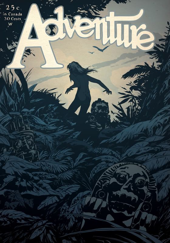
Image with Pulp magazine Adventure logo

Earlier this year, for about two months, the Society of Illustrators had an exhibit of Robert Lesser's Pulp Art collection. To this day, it's the one show that really stood out to me while working there. I was amazed by these oil paintings- quickly slapped down by artists like HJ Ward, Norman Saunders, Rafael De Soto, etc. And despite some reviews here and there I've read about the work, I think the craftmanship is remarkable. Sure, they are a bit rushed, but they had to be in order to survive in that line of work. Ever since that show I've been wanting do something along those lines.

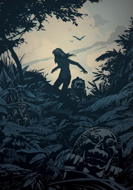
Doing a Damsel in Distress/ Femme Fatale on the cover only seemed right. At the same time, to go in with my heavy blacks and leave them with the job of defining shadows in this creepy jungle. Despite the lure of a sexy figure, that trail can't lead to anything good.
Photobucket
Final image without text

Photobucket
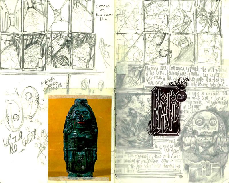
Initial thumbs and reference from my sketchbook
Pencil sketches under a layer of inked tracing paper
Photobucket
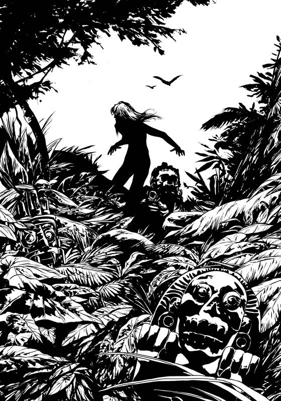
Linework

Also, don't ask me why, but after inking this, I realized those two bird have appeared in drawings of mine before. I can't help it. I like those two birds.

Speaking of birds, Happy Thanksgiving! Hope everyone has a nice week. I'll be in touch.

Tuesday, November 15, 2011

The New Gold Rush

Photobucket
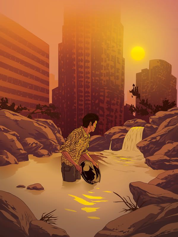
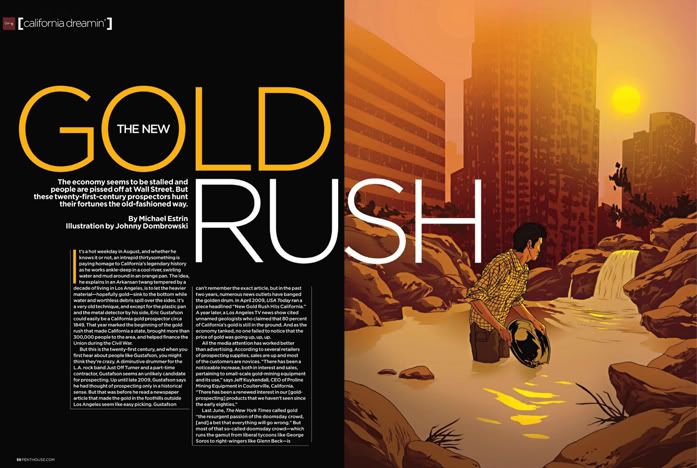
Here's a new illustration I did for a recent issue of Penthouse. It was for an interesting article about 20-30 year olds going back up in to the mountains above LA to pan for gold just like the 49ers use to. With the economic crisis we've been in, people are willing to try anything to get some extra money. I, personally, think it's an awesome idea.

Big thanks to Art Director John Faraci

Photobucket
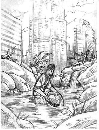
Sketch

Photobucket
Layout

Wednesday, November 2, 2011

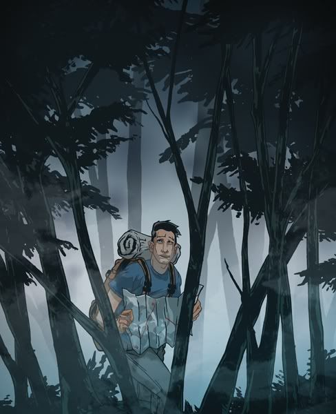
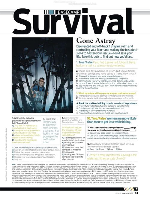
Backpacker | Gone Astray

Here's another illustration I did for Backpacker's Survival Quiz. This issue's theme was the risk of becoming lost in the wild.
Photobucket

Photobucket
Layout

Big thanks again to Jackie McCaffrey for the awesome Art Direction!

Monday, September 26, 2011

Sketchbook

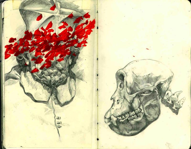
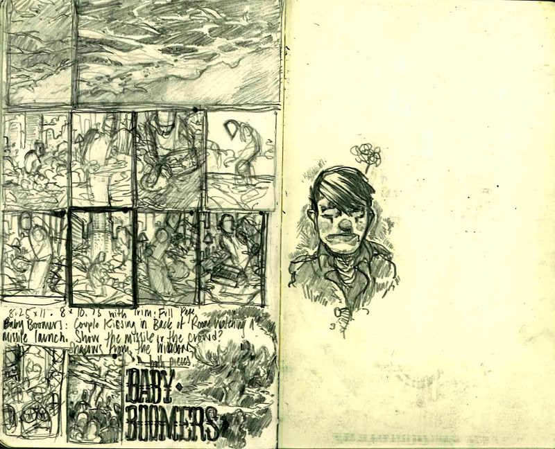
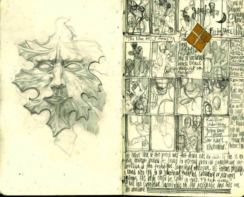
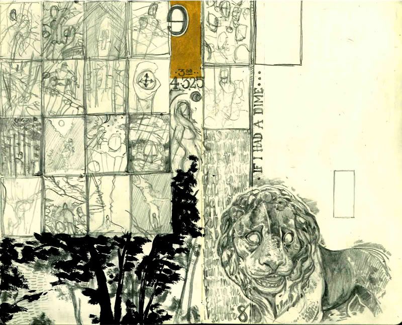
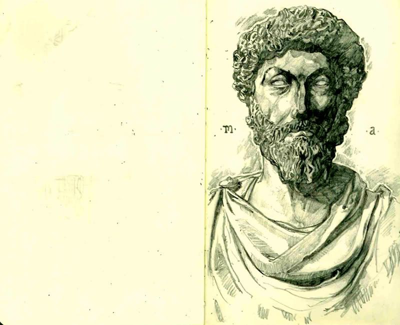
Finishing up a few personal things that I'll post soon. In the mean time you can take a look at a few of my sketchbook pages and how obsessive I am with filling the page. Be it with drawings or pointless rambling.

PhotobucketPhotobucketPhotobucketPhotobucketPhotobucket

Sunday, September 4, 2011

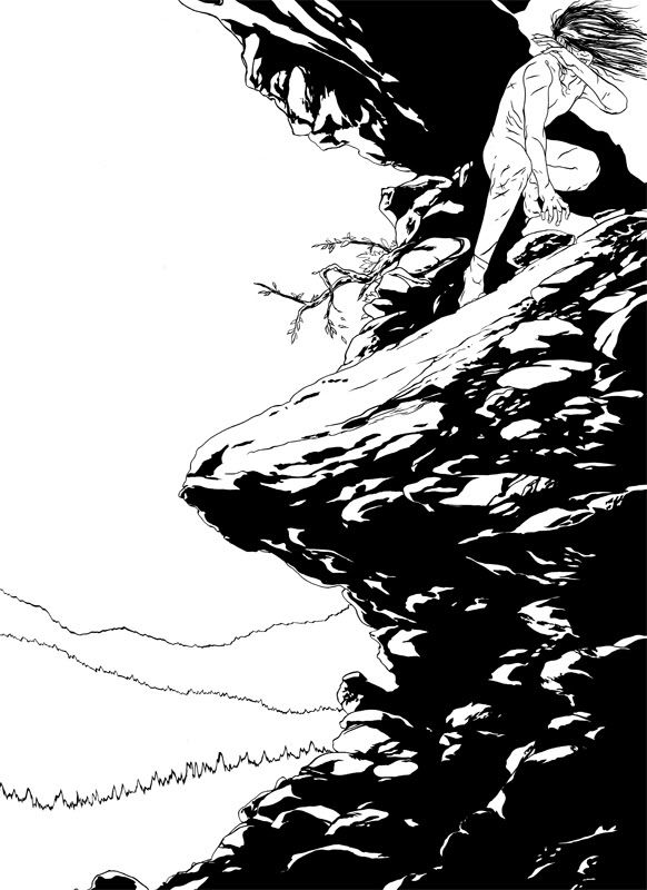
Homo Ferus | Cracked Sky

Photobucket

Hope all is well with everyone. Especially after the hurricane for those on the east coast. Fortunately, I've been busy with a good amount of freelance work lately. Unfortunately, I can't show any of it to you. Yet. All in good time.

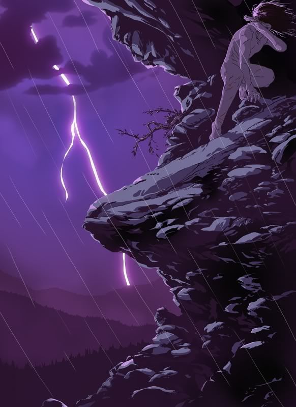
In the mean time, here is the new Homo Ferus. And one of many more to come, I might add. Every time I finish one, I think of three more to draw. Trying to concentrate on the essentials of survival, hunger and food for the first two, I now wanted to approach shelter and exposure to the elements.

I've been considering posting some detail shots everyonce and a while. Maybe I'll do it for this one. We'll see.

Photobucket
Linework

It's got to that point where I've begun to describe the series to other people and even with only three pieces finished, this boy is certainly growing as a character for me. While only those three are done, I have his entire story, perhaps even life, planned out.

Photobucket
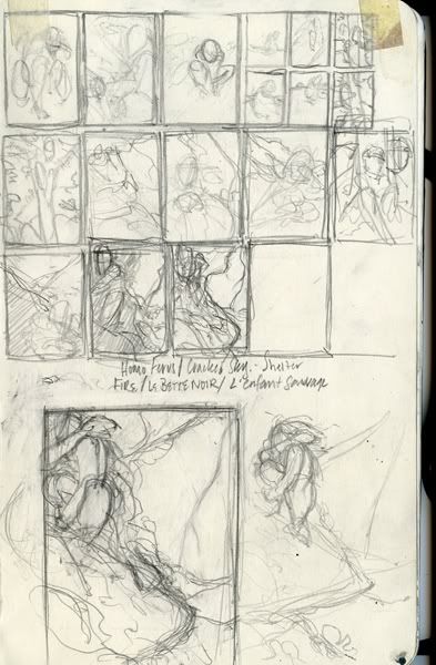
Thumbs/Sketches

And yet at the same time, I haven't given him a name. To be honest, I'm somewhat against it. I only refer to him as "Boy" or "The Child." Even in the original photoshop files. He's never had a name and frankly, doesn't even know what a name is. Doesn't matter to him so why should it matter to me.
In addition to that, I don't want to give him the personality that comes with the name. Because of my initial argument, there is still something missing in him that would bring him to that point. The point where he's completely human. There's no developed thought present in that head of his. And that reminder is a bit unnerving.

Thursday, August 11, 2011

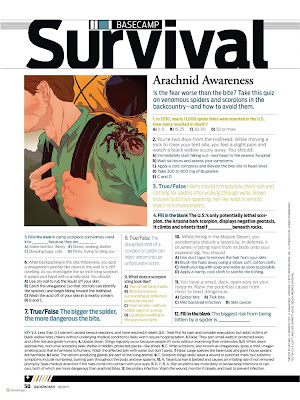
Backpacker | Arachnid Awareness

Here's a recent illustration I did for the September issue of Backpacker Magazine, which just came out a few days ago. In every issue there's a section call Survival, and in that, a Basecamp Survival Quiz. Each month has its own theme and topic.
Sketch
Jackie McCaffrey, the Associate Art Director over at Backpacker, asked me to run with the idea of Spiders. I had a bunch of fun working on this, of course. A big scary spider? What more could I ask for? The sketch was approved so I went to the final. Same process as usual- I do the linework in ink and then color digitally. Big thanks to Jackie and everyone at Backpacker!
Layout

Wednesday, July 27, 2011

Maxim | Modern Monsters

Another group of illustrations I did- this time for the August Issue of Maxim. With the Modern Monsters Theme, I had to illustrate celebrities/ reality tv show stars as mythological creatures.
Art Direction by Eric Ku.
Click image for larger illustrations or go to:
http://www.johnnydombrowski.com/illustration/maxim--mondern-monsters/

(layout)

Sunday, July 24, 2011

I'm not a Terminator, I'm a princess!

Two new illustrations I did for the August issue of Wired that just came out recently. I had to illustrate two directors' viewpoints on where the Terminator franchise will go. One would be an all out epic while the other would combine with the greatest movie of all time, Kindergarten Cop.
Art Direction by Alice Cho!

Sketches
We opted for the second and fifth versions for the two, with adding some palm trees in the background for the epic and bring over some of the background from the other versions for Kindergarten Cop.

Layout


You should be cleaning the diapers. You should be reading stories about bears that go shopping!

Monday, June 27, 2011

The Roaring

A personal piece that started as my Sketches for "The Great." A image of warning between the Great War and Great Depression. After finishing, it didn't seem as menacing as I originally thought it would, so I renamed it for the Roaring Twenties.
Made with Ink and Digital Color/Collage
I chose the Flatiron Building because- beyond being my favorite building in the city- to me, it's the best representation of Old New York City. The Empire State Building wasn't completed until the early 30's so I felt that The Fuller building on Broadway and 5th had a better feeling with just as much or even more character.
I've been busy with a few jobs so I'll be able to post those as soon as they publish. More coming soon.

Sunday, April 10, 2011

Homo Ferus | Strength in Numbers

Just finished this tonight. With the amount of feedback I've received for the first Homo Ferus, the urge and pressure was on to continue the series. I've been going through a long dry spell so it feels good to break out of it. Sketch: About 6 1/2 x 9 inches.
One part of my work that I don't tend to show you is all of the tracing paper I go through. While I'm working on a piece, if I have the slightest bit of doubt of how I should draw something, I'll always sketch it out over the drawing. Before having him jump on the back of the elk, I originally drew him running behind- which you can see in the initial sketch. Along with a few drawings to get his hand right, you can see what the original pose looked like.Above: Original pose for the boy around a few wolves. Below: A few variations of his hand with the final version on the bottom.
Coloring it was also a challenge. Unlike the first, I had no idea what time of day I wanted to set it in. With a few ideas in mind, a dense fog quickly became the winner. I'm already working on sketches for another idea. I'm going to step away from Homo Ferus for a bit but he'll be back. Also, I may be working on a short comic soon but I'll keep you posted on that later. All the best.Inked line work: Around 18 x 24 inches.

Wednesday, April 6, 2011

Moleskin pages

Coloring a second Homo Ferus illustration. It's starting out slowly but getting there. Much harder to figure out the lighting in this one compared to the first. In the mean time, here are some more pages from a new(er) sketchbook...
Left are some thumbs for an idea I'm working on at the moment. (You can see the page in my sketchbook in a photo from an earlier post!) It was for an illustration about the return to normalcy and the eventual great depression between the two wars. Graphite with inked tracing paper.
On the right is a quick sketch I did during the Society of Illustrators' sketch night this last Tuesday. Most of the time, I'll just hang out by the bar and do the crossword but every once and a while, I'll spot a pose I love and draw it in. This being one of them. That model is great too- love her hair.
One thing I tend to play around with in my sketchbook is design. Though I never find a way to incorporate it into my work, I love typography and play around with it as much as I can.
And this is what happens when I don't draw in pencil. Not a pretty sight. I hated it so much I had to either rip the page out or draw it again. An interesting before and after though.

Sunday, March 20, 2011


Working on a few things lately. Along with doing a bit of coloring, I'm also working on another addition to my Homo Ferus series. It's been fighting back, but it'll get there soon. Looks promising, too. I was drawing for most of the morning when I found myself in a serious block. Nothing seemed to work so I decided to take a break with final work and loosen up in my sketch book for a bit. These four were my favorites out of the bunch. All of them were done with Pentel brush pens.

Saturday, February 12, 2011

Scholarship Show and more...

Some good news happened the other day. Two of my pieces were accepted into the Society of Illustrators' Student Scholarship show. The two that got in were Kumaon and Passerby:

In other news, besides finishing a few other projects, I'm starting up some more personal work- which means more posts for everyone to check out. Whether it's process shots, finished work, or just other posts, I'll be sure to start posting more frequently. I know, I know, I sound like a broken record. I'll believe it when I see it...
A few call for entry deadlines are coming up, so I've been mostly working towards that. American Illustration is the next big one. Don't think I made it in to Communication Arts but I'm not entirely sure. Oh well, if not, there's always next year. I'll keep you posted. Hope everyone is keeping busy. All the best.