Monday, December 6, 2010

Hardboiled

Better quality version on my website: http://johnnydombrowski.com/illustration/hardboiled/

Hardboiled fiction- mostly concerning crime- is a literary style that tends to have an "unsentimental portrayal of violence and sex." Shooting a man face to face was just another day on the job. I've been reading who knows how much of Raymond Chandler and he's quickly becoming my favorite author. On top of that, I've been watching a bunch of movies like The Maltese Falcon and, maybe one of my favorite movies, In A Lonely Place. All of that detective fiction and film noir, definitely helped spark the piece.

Since I had so much fun drawing smoke in some other illustrations, I wanted to rework it as an aesthetic instead of working as a big part of the storytelling. And one thing they did do, was smoke. That's all those movies were made out of, anyway. Shadows and smoke.
Taking a little break from my Homo Ferus ideas, I wanted to illustrated a moment that could be considered either raunchy or violent. And most importantly, him not caring either way. Characters like Marlowe could be beaten within an inch of their lives and yet still manage at being a smart ass. Whether they can get themselves out of trouble is another story.

I may be posting some detail shots soon. Depends. Also, I've been thinking about blogging on more than just new artwork. It's a blog, after all. Why not use it to its full potential? Hope all is well.
-Johnny.

Friday, November 19, 2010

SOI 53 Annual

Some good news popped up recently- thought I'd share it with everyone. I found out this week that I had two pieces accepted into the Society of Illustrator's 53rd Annual Exhibit and Book! Really exciting. The two pieces that got in were Homo Ferus and Passerby- my two most recent. -Johnny

Thursday, October 28, 2010

I'm really slow with adding new posts but I am working on stuff! More work coming hopefully soon. Halloween= watching scary movies and drawing all weekend.

Monday, October 4, 2010

Homo Ferus | Desperation

As always-for a better quality image- view the piece of my website:
http://johnnydombrowski.com/illustration/homo-ferus--desperation/

I'm back from the dead! Here's a piece I just finished tonight. It'll hopefully be the first of a series following feral children. Children who grow up in the wild or in complete isolation from any form of social contact with other humans. Homo Ferus was a term coined by Carl Von Linné (I believe, correct me if I'm wrong) which places the feral child in a stage between animal and man. Not quite either. What makes us man? Is Nurture really that much more important than Nature? It seems like it, yeah. There have been cases of children being locked in a single room for years at a time to the more legendary examples of kids actually being raised by wolves. These children would tend to walk on all fours and even bark and act like dogs.
During the sketch stage, I wanted the first image to put the child alone fighting against the elements, and in this case, hunger. With no options or knowledge for another way out, he resorts to desperate grabbing of fish in a nearby river. I stayed pretty faithful to the sketch with the hair being the one exception. As the idea developed, I wanted the boy's face covered up in this, and most likely, in every illustration from the series. Since we relate to someone the easiest through their eyes or face, I wanted to take that safety net away from the viewer and portray him as, in a way, just another beast in the wild. That's when Ian Laser Higginbotham, a friend and fellow artist, mentioned the idea of having his hair soaking wet and dripping over his face. Perfect! After the ink drawing was done, I colored it digitally in photoshop as usual.I'll keep in touch- more where this came from. Let me know what you think! Talk to you later.
-Johnny

Saturday, July 24, 2010

Stage Fright

Ink, Acrylic, Chalk

What started out as a simple piece about theft, turned me into that experimental artist living inside of me. It may not be much visually but for me the thought is there.

Since narrative is such a strong focus in illustration- the part of me that wants to make it incredibly abstract is usually taken out of the picture. In fact, it only really shows up when I'm working in my sketchbook. If you look back and some of my personal work like Hugo or Son, you can see what I mean.

I had originally planned for this piece to be about the fear or anxiety before committing a crime. I'm a bit fascinated about criminal psychology. For example, how certain criminals can rob the same place or store over and over again. I guess we are creatures of habit. Even when it comes to somethings as extreme as stealing or holding someone and gun point.

Saturday, July 10, 2010

Southwest

For a better quality image of this, check it out on my website: Southwest

Hey everybody, here's a new illustration I just recently finished. Hope you like it! There wasn't much of a concept behind it. It may even be cliche but I don't care. I had fun. Time flies when you're having fun! Also, below are the color studies I played around with before I started to paint the line-work. Most of the time, I usually jump in head first and fool around with colors- like I did for If and When- but for this I wanted the color palette to be really simple. I figured I would test it out in photoshop first. You know, dip my toes in, if we're going to keep up the water analogy. And hey! The picture has water in it! Coincidence?! Yeah, it was.
I'm heading back to Connecticut for the weekend to see the family and hang out with my sisters which ought to be fun too. Fun flies when you're having fun! Okay. Up next I'm going to start a series I'm working on with a few friends. So more info on that when it starts to manifest itself. Talk to you guys later.
-Johnny

Wednesday, June 30, 2010

If and When


If and When
Inks and Acrylic

Hey everybody, sorry for the lack of posts. Hopefully that will be stopping soon. Here's a new illustration I finished recently. I'm trying to move away from Digital at least a little bit, but most importantly, I'm trying to loosen up. I always tend to be very precious with my work. While some care in that area is good, too much can really hold you back.

The times when I honestly and/or totally wreck a piece and just go crazy with it, tend to be the moments I really have fun creating work and end up with some of my favorite pieces.

Stop being so precious.

Be more daring.

There's always been this craving to buy a motorcycle in the back of my head. Especially when I was a kid. One thing that really struck me was a comment someone in my family made. It's not a question of if you'll get into an accident, but rather when. It's seems like that cliche one-liner at the end of every History Channel natural disaster TV show, but it stuck with me for some reason. The last place you want to get in an accident is on a bike. I wanted to play around with my approach so I thought it would be a dynamic image to play around with. Hope you like it! I'll try to keep posting work- be finished illustrations, sketchbook stuff or otherwise. I'll keep you posted.
-Johnny

Tuesday, June 1, 2010

Death Upon Death


An illustration I did for "The Book of Skulls" a book that Faye Dowling is putting together at the moment. It seemed like it was right up my alley so I thought it would be fun to try it out. And it was! She's considering it for the book so hopefully I get in! I'll keep you posted...

The Skull has always been an iconic image connected with things like change, fear, and of course, death. Whether is was used as a symbol of mortality or just plain evil, it was an image not to be trifled with. Lately however, It's become more and more trendy. In fact, it's become one of the most common features in art today. We can only use something so much before it comes a cliché. Before it becomes yet another feature in that big stereotype parade.

Is the skull doomed to walk the same path as the wilting flower or the snuffed out candle? And with that repetition, are we shattering everything that the skull originally stood for?

I always try to throw in, at least a bit of symbolism or metaphor into my work and it seems like the people most successful are those who take those clichés and present them in an unexpected way. There's so much pressure to be brand new and unique in illustration and it's comforting to think that we don't have to come up with absolutely everything we put down on paper or canvas.

As usual the image on here is a bit washed out and even blurry. If you want to see a better version of it, check it out on my website:
http://johnnydombrowski.com/illustration/death-upon-death/
-Johnny

Thursday, May 27, 2010

Jonathan Weiner


I recently did a illustration for the Village Voice! A portrait of the Pulitzer Prize winning author, Jonathan Weiner. The article was an interview with him on the idea of immortality. I felt that, with his previous books and the idea of rejuvenating or even perennial life in nature, it would be an interesting setting for the portrait.

Art Direction by John Dixon

Sunday, May 23, 2010

Motif | Thought Processor NYC


Hey everybody, The Thought Processor was really cool. A bunch of cool looking people showed up. I wasn't there for long- just passing through. It's still up so if you have the chance you should check it out.

I did this piece for the show. It's untitled there but I've since named it Motif. Sorry for the confusion. Hope you like it. Some of you may have already seen it and if that's the case... look at it again! It's 18 x 24 and done in Ink and Watercolor. All of that aging or... I guess just damage, is actually on the paper. I've played around with watercolor washes over some smaller pieces but never with some as big as this. When it started to happen- you could say I went into a bit of a panic but I later decided to embrace it and push it even further. Fortunately, the results came out looking pretty interesting.

Anyway, I'm trying to keep busy. I'll keep you posted with anything I'm up to. More coming soon.
-Johnny

Sunday, May 16, 2010

More work coming...

Hey everybody! Sorry I haven't been posting all that much lately, I'm working on a few jobs here and there and I'm trying to do some personal stuff on top of that. In other words, I'll have some to put up hopefully soon.

Monday, May 10, 2010

Thought Processor|NYC Series


Hope to see you there! I have a piece up along with a paper doll I designed and put together. The doll was a bit hectic to build but the final outcome was worth it. Like it says in the invitation, the show opens May 21st and the opening party is from 6 to 9. All of the pieces and dolls will be on sale so maybe you'll find something you can't leave without or just go for the... atmosphere. Sure! I'm starting a few more things this week so I'll keep you posted.
-Johnny

Tuesday, April 20, 2010

Naturally Violent/Violet


Hey everybody, Here's a new Illustration I did for portfolio class. It's on the topic of whether we've inherited violence through out evolution from chimpanzees. After coloring it, I was playing around for a bit and took away the linework and ended up with the second image. I thought it was pretty cool! Named it "Naturally Violet" for the fun of it. It's fun! Wordplay is fun!

Also, I'm noticing that blogspot is washing out the images A LOT, which is usually the problem here. So if you wanna see cleaner versions of them- check them out on my website: http://www.johnnydombrowski.com/illustration/naturally-violentviolet/

Which one do you like better? Let me know what you think!
-Johnny

Wednesday, April 14, 2010

Ubasute

"...refers to the custom allegedly performed in Japan in the distant past, whereby an infirm or elderly relative was carried to a mountain, or some other remote, desolate place, and left there to die, either by dehydration, starvation, or exposure."
Japan: An Illustrated Encyclopedia

My latest and last assignment in my portfolio class was to illustrate "The End." What it's the end of? Well, that was for us to decide. Coincidentally, my teacher in human nature mentioned how Inuits and Japanese have folklore concerning the abandonment of elders in the mountains or out on the ice. The idea haunted me and seemed like a perfect topic for the piece.

Also, you might see that I'm trying to play around with a signature. For the longest time I've never dreamed of signing my own work and even now, it's been added later on. In the realm of commercial artwork, it seems preposterous to sign your name. Instead, the most you usually get is credit in the fine print. Certainly better than no credit at all, of course...

Wednesday, March 17, 2010

Leagues


What started out as a cover for 20,000 Leagues Under the Sea by Jules Verne, went a bit on it's own direction. It's been really interesting and yet, difficult to color my stuff recently. With the detail I put into my linework, it gets to a point where I can't really render anything. It'll only take away from the illustration. It has to get to a point where the color will only add to the scene, and in this case, add another level of intensity to it. At first, my plan was to color it in shades of blue... Ocean=Water=Blue. Seems simple enough.
But as I thought about it, the cool blues didn't fit with the scene at all. This surrounded diver fighting for his life. I always love to lay down a few shades of one color and then experiment with the Hue and Saturation. When I got to the red, it seemed to fit perfectly and gave it even more potency.
In the process of this- after the playing around with an infinite number of color palettes- I was trying to add some soft elements here and there, but they never worked. One, for example, the light shining out of the helmet was a much softer, more blurry element around the diver. Against the sharp flats in the rest of the image, it just didn't seem right.
Anyways, I like how it came out and the flats were just fine for me. Let me know what you think!
-Johnny

Monday, February 22, 2010

35th Humana Festival Poster


Hey everybody, I finally got around to coloring my typewriter image and added text as well. I wouldn't be surprised if it was too late to submit it to the festival but regardless, I like the way it came out.

For Tomer's portfolio class, we had to design a poster for the 35th Humana Festival of New American Plays incorporating the writers imagination and creativity somehow. Below is the original version I submitted which was, unfortunately, very rushed. I may still write an email to the people at the festival at least to show them the updated version. No strings attached.
Like night and day, right? I was pretty upset with the first version since, as you can tell, it's not very good. Oh well, at least I had fun making the second version! Let me know that you guys think! Thanks, and I hope to hear from you soon!
-Johnny

Monday, February 1, 2010

Kumaon

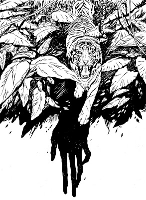
In Tomer's class, we were assigned to pick any topic of our choosing and illustrate four images surrounding it. Though at first going crazy with the infinite amount of possible ideas, I finally decided to go with my gut reaction and concentrate on the Man-Eating Tigers in the Kumaon district in India. On top of that, following Jim Corbett, a colonel in the British Indian Army known for killing a bunch of those big cats in the early 1900's. That's one heck of a gut reaction...

Anyway, I've pushed myself to up the ante and do these four on 18 x 24 paper- which is a pretty big feat for me since I tend to caught up in the details. Here's the first or four:linework (ink)
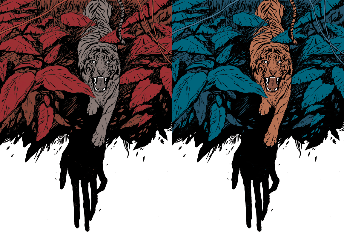
I opted to color it much more simply than other pieces I've done. Since the drawing is good enough on it's own, I didn't want the coloring to make it too busy.
color (digital)
Also, something really cool: I was playing around with color palettes and narrowed it down to two. One being the red/grey palette I chose as the final, and a blue/orange combo. I was switching back and forth between the two when, just for the hell of it, I switched back and forth faster and faster. One thing lead to another and I made the GIF below. It gives it that awesome stereograph, 3D feel to it but the line work isn't actually moving at all. Pri-tty cooooool.
Photobucket
Hope you guys like it. The other three will be posted in the upcoming weeks! Talk to you later...

Humana

Here's an image I did for Tomer's Portfolio class. We had to design a poster for the Humana Festival of New American Plays. Though I'm thinking about coloring it, there's a big part of me that loves it just in black and white: